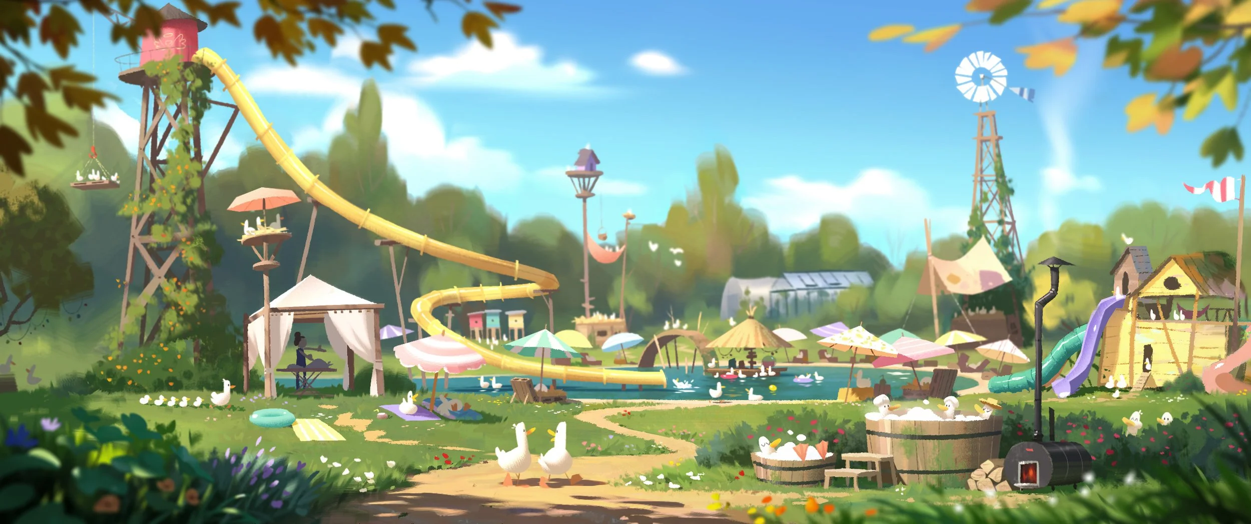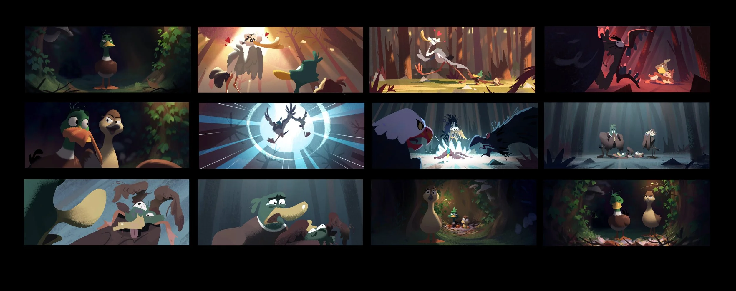
It’s been a lovely couple of years working on Migration, helping build this new franchise, see those characters take shape and dive into their environments. I loved painting all the beautiful landscapes and natural settings. We were aiming for quite an ambitious cinematography and I learned a lot from it. I’m very happy with the final look, the camera work, lighting and comp is outstanding ! I’m glad I was able to bring a little brick to the wall, and very thankful to the directors and my art director for their grand trust.
I was in charge of some look development, background color design and then mostly colorscript and color keys. Work done between 2019 and 2022.
Directors: Benjamin Renner and Guylo Homsi - Art director: Colin Stimpson
All images © Universal Pictures
Look development.
With Migration the directors were looking for something more naturalistic than previous Illumination movies, with the kind of cinematography we would see in wild life documentaries. Great natural lighting, shallow depth of field, bokehs and so on. But leaning toward realism, CG rendering often leads to images overloaded with details. Working on these couple of development images, the biref I got from the directors was to get the same feeling that you would get in a live action film with amazing phtography. Well, that wasn’t an easy task ! It took me a long while to crack the code. But what I understood is that despite the many details, grouping the values and having clear light and shadow masses helped clearing the composition and get a strong photography. It was a lot of very interesting reaserch, tests and conversations.
Layout by master Vincent Massy.
Environment Color Design.
Here are some paintings based on the set designers’s work, to define colors and surfaces. This will serve as a guide for the CG texturing artists. I spent quite a lot of time on the duck farm, loved this place and its design ! There are also a few designs I was happy to help with.
Color Keys.
The process of colorscript was some kind of ping pong between art director Colin Stimpson and myself. There’s been a lot of iterations as we were trying to figure out the look of the film, considering the wishes of the directors, the demands of production and our own input. It took months to sort out the first act happening in the pond. That wasn’t easy but at the same time, what a great luck to be given the time to explore and experiment, looking for the right approach. I believe we reached a very appealing and subtle aesthetic with Migration.
These color keys serve as a guide to the lighting and compositing departments. As always, they did an amazing job understanding the direction and bringing their magic to deliver such beautiful shots.
This has been the most interesting work to me. To get the right feeling of light in those natural environments, it was a nice combination of research and bringing my own souvenirs and observations. I could really see myself grow in skills trhough this challenge and I’m still proud of the work I came to deliver.
Paintings made from CG layout or storyboard panels.
The Opening Sequence.
Migration opens with a sweet sequence in a storybook look. This went through a lot of explorations and concepts from some amazing artists. My role was then to take the best out of it and define a final look. It’s been a tidious but very interesting task. Here are some layouts and backgrounds I came up with. I also helped a little bit on the characters rendering look to unify the whole.
Characters reference paintings.
Here’s a selection of characters painting over Zbrush models to guide the surfacing team. It was quite a challenge to get the right balance in simplifying the feather patterns but still gat a naturalistic feel. The scale of the feathers was key and it took a lot of iterations.


